Apple has a history of taking its sweet time to integrate features that have been there for Android users for years. One prime example is widgets. Introduced just 2 years ago in iOS 14. On the other side, Android had widgets since its release with T-mobile G1. That’s a difference of more than a decade and there is no doubt about the actual usability of Widgets too. Most importantly, Apple users are loving it and have their home screens filled with it.
Almost the same story is with the Always-on display, Android users have had it since Samsung Galaxy S7 was released in 2016. Now, after 6 years, Apple added this feature to iPhone 14 Pro in 2022.
What took Apple so long? Let’s explore some reasons.
Was Apple Not Ready?
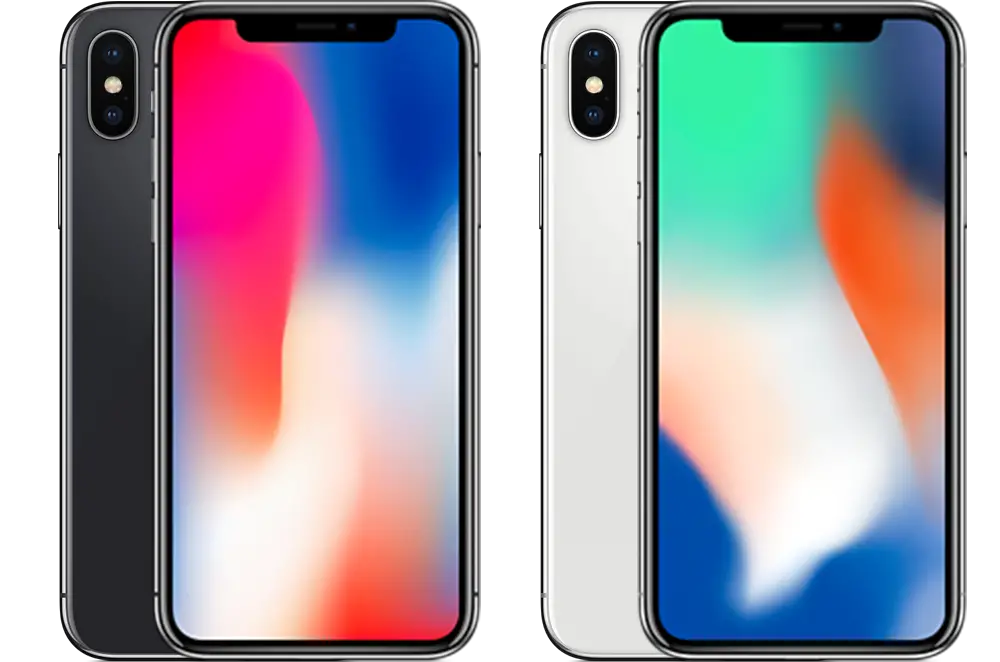
Being ready to add a feature such as an always-on display is dependent both on hardware and software. In terms of the bare minimum requirement, Apple was ready since iPhone X was released in 2017. It was Apple’s first smartphone to have an OLED display instead of an IPS panel.

In the case of an IPS panel, even if you have only a clock or a widget visible on the screen, the screen would still be consuming the same power as compared to having a colorful image displayed. In contrast, on the OLED panel, only those pixels that are currently displaying something are turned on/illuminated, the rest remain switched off and save power. That is the core ingredient of the always-on display.
In most Android always-on display implementations, you only have a clock, calendar, or notification icon on it. The rest of the screen is pitch black, saving all the power. Even small Chinese Android brands in low-mid budget phones having OLED displays are supporting always-on display. Surely, Apple has best-in-class OLED displays from the grand father of OLED, Samsung.
Why were they not letting their user have it?
Superior Battery Saving
One of the reasons is focusing more on the battery department. As Apple A series SOCs are getting better in CPU, GPU, and AI performance every year, and adding more layers of image processing like photographic styles and photonic engine, there is a limit when adding more features can start hurting the battery life. So, Apple has carefully taken care of this in all phone departments, software, hardware, and user experience.
Hardware improvements
Apple not only utilized a variable refresh rate OLED display to show super smooth 120 Hz animations when needed but also clocked it down to as low as 1 Hz, which means your display only updates the shown content 1 time per second. This is a huge win for battery life and adds zero downsides to the user experience as all the updates happening on the lock screen like clock and notification can easily do away with 1 update per second.
Secondly, they made a move that only Apple can do with having their homemade chips on their phone. Apple’s latest A16 bionic SOC for the iPhone 14 pro has multiple special hardware called ‘coprocessors’ backed in, which helps refresh the always-on display with minimal power usage. This is one clever use of hardware, we would probably not see in Android any time soon.
On the Android side, they have SOCs from Qualcomm or Mediatek, software from Google, and hundreds of manufacturers. Doing such kind of collaboration for such a niche benefit of a small feature is not easy for Android manufacturers.
Apple’s way or no way
Apple is known to do things differently and, ahem, think different-ly. I would say that this was the major reason holding Apple back. Even though Apple has carefully taken measures from SOC to display refresh rate to save power, even the Samsung Galaxy S7’s naive implementation of always on display was not that hard on its battery life. In the S7 era testing with a smaller battery size, it used way less than 1 percent battery per hour. Keep in mind that battery sizes at that time were way smaller than today’s phones. Galaxy S7 had a size of 3000 mAh while today’s Phone 14 Pro Max has a 4323 mAh battery.
Apple just wanted to have a different and, importantly, better implementation of the always-on display. While Apple’s implementation of Widgets is very similar to Android’s and does not justify having us wait more than a decade to have it, the always-on display is way different.
The Apple’s Always-on Display Difference
The whole display remains lit
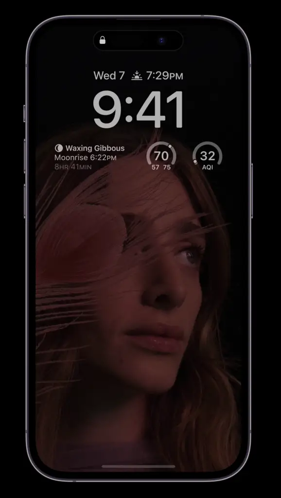
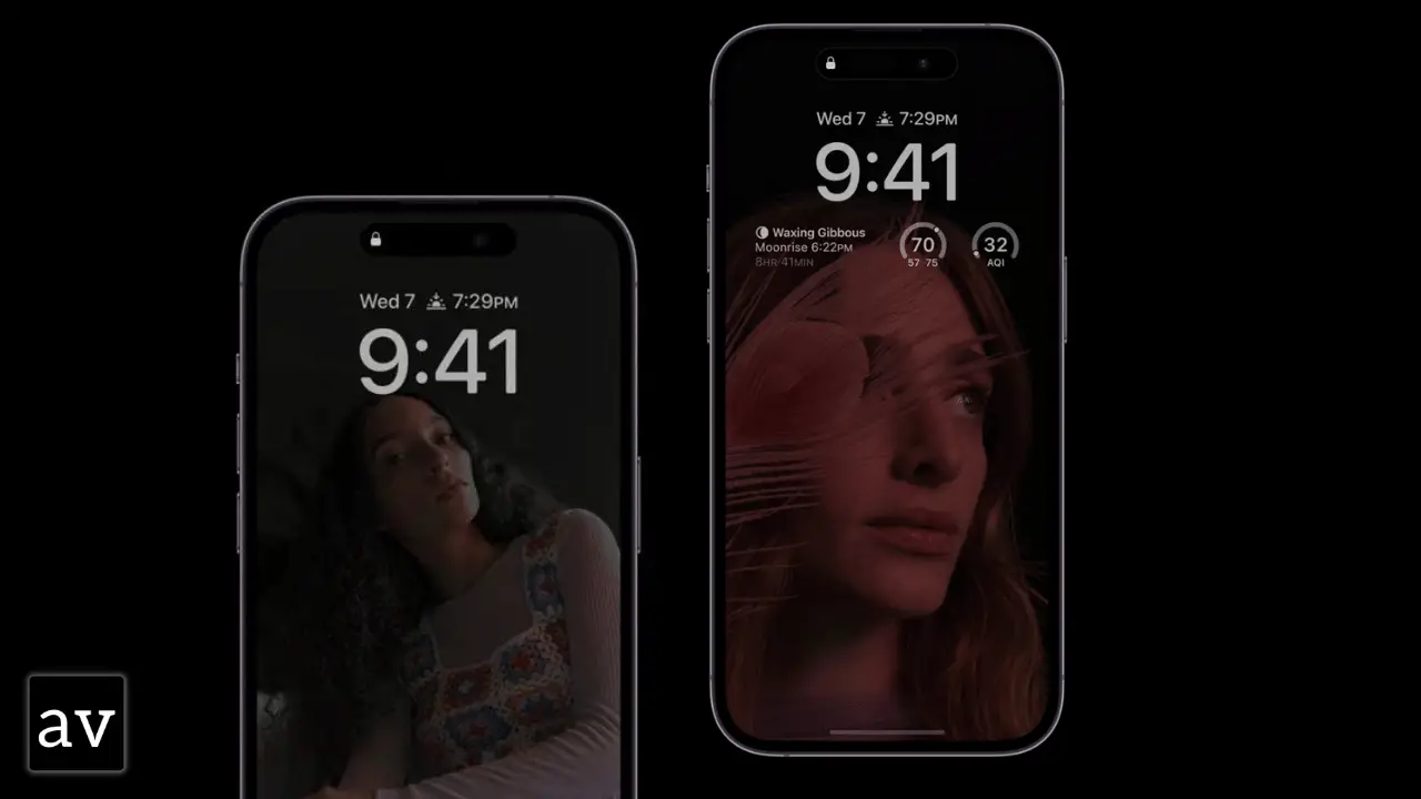
While Android implementation relies on having only key information and keeping the rest of the screen black, Apple has gone all-in and keeps the whole screen alive, albeit, dim. It includes your whole wallpaper, notifications and their one-line detail, along with widgets, calendars, weather, and more.
Almost every user of the iPhone 14 Pro has a strong opinion about it. Some are loving it but many are saying that it is a distraction to have wallpaper and so much more all the time.
I would say that it is a bit extra!
Apple just did it for cosmetic purposes and to show Android that they can even do features like always-on display better than you. The reason is to just not let their always-on display implementation blend in with the Android one and not let the Android manufacturer easily copy as they always do. Just like how Apple has a weird back camera layout, or their persistence to not go back to TouchID/in-display fingerprint sensor. All of these efforts are just to keep Apple visually different than the rest of the competition and having a bit of extra always-on display would serve that purpose.

An intelligent approach to the power saving
Many Android phones use the proximity sensor and ambient light sensor to detect whether the phone is in dark or in the pocket to turn off the always-on display to save power but Apple has gone the extra mile in this aspect too.
Besides the common-sense way of assuming when you’re not gonna need the always-on display like when the phone is facing downwards or if your phone is in low-power mode, Apple has used its ecosystem well like
- The always-on display turns off automatically when you walk away from the phone and are wearing an Apple Watch.
- Also turns off if you’re connected to CarPlay or Continuity Camera or when sleep focus mode is on.
An as-usual strict approach to customization
Everyone praised Apple when they added a ton of lock screen customizations to iOS 16. Even with the Android 13 release, Android lock screen customization is far behind what Apple has done in iOS 16. But, Apple did the opposite for the always-on display. Besides an option to turn off the always-on display (thanks Apple, we are not taking this for granted, promise!), there isn’t much you can change about the appearance of the always-on display.
There can be two main reasons why the always-on-screen customization is kept to a non-existing minimum:
- Simplicity:
Just like most of the features, Apple likes to keep things simple. While they have granted us permission to customize our lock screen, having a separate layout for the lock screen and always-on display can be a bit overwhelming for non-hardcore users.
Also, this simplicity leads to beautiful transitions when you wake the display from the always-on state and I guess a good animation is worth some missed customization opportunity for a lot of people in Cupertino. - Same Apple Way:
Just like stated above how Apple wants to differentiate itself from the competition and doesn’t want comparisons, they also want to have a standard presentation for its products.
The always-on display is a key part of that presentation. Just like the back of the phone that is ever present and displays its gorgeous glass to the competition, the front is now also ever presenting itself and that presentation must be up to Apple’s standard.
What’s Next?
The tale of fanboys saying that the other party copied their feature is ever-present since the inception of Steve Jobs’s iPhone 2007. Android copied Apple’s innovative thinking of how a smartphone should look with an all-screen front and multitouch input.
Apple has taken a fair share from the Android side too: notably widgets, always-on display, ultra-wide camera thanks to LG, and much more.
The real question is what should be the next step from here? We know that in reality, everyone is the winner here. It doesn’t matter who implemented a feature first if everyone is benefiting from it now.
Let’s start with what I would like for Apple to copy from Android next:
- Please Apple, Copy the Type-C connector, and while doing that copy their ultra-fast charging too.
- Having a small display on the side of the cameras just like Samsung Galaxy Z Flip, for notifications and using the back cameras for vlogging would be great.
- Even better why not just copy the whole format of the Samsung Galaxy Z Flip? Everyone is loving that folding format more than Galaxy Z fold. It keeps the phone way more portable while also being equally useful and being in a trusted vertical bar shape.
- Can we try what Samsung and ZTE are doing with their front camera and making them invisible? I know with all the “Dynamic Island” hype, we’re not going to see that anytime soon. But, just keep that in mind for later.
Let’s end with what Android should copy from Apple:
- There is no excuse for not getting timely updates after 13 major releases of Android. Learn it from Pros, Google. You gotta make sure that OEM sticks to a timely schedule or take more control of the updates. The Android brand image is associated more with Google than its phone manufacturer.
- We know, at least with OEM skins like OneUI, OxygenOS, and EMUI, the lock screen customization of Apple would be copied soon, but, I want Android to take care of it on their own in the clean native Android so we can have a consistent lock screen customization across all the Android phones.
- The emergency satellite feature on the other side is nice too.
- Lastly, Apple has taken one step at a time for reparability, by making the back panel replaceable only on iPhone 14. Even though there is a lot that can be done in this department, at least, they took a great step in making what was a very complex repair easier. When Apple glues everything inside its products, everyone follows suit. But, it would be very great for our pockets and the environment if everyone follows Apple’s approach and make their phone and other gadgets a bit more repairable, just one step at a time.
Let me know in the comments section what is your wishlist for Apple and Google.


